Colour Contrast Conundrums
July 29, 2022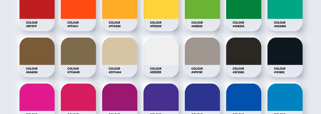
WCAG colour contrast guidelines for designing accessible documents are well documented online. The questions we receive at Accessibil-IT are often more practical. Some common questions we receive include:
- How do we choose and test colours for contrast? Is it just a matter of trial and error?
- If our organization has an approved suite of brand colours to choose from, will they all work together?
- If it looks like the contrast is strong enough, will that suffice?
- The colour contrast is passing recognized colour contrast tools however the WCAG testing tool is failing them. What do I do?
Choosing colours which meet colour contrast guidelines is not as daunting as it may initially seem. If your organization has an approved suite of brand colours, then that’s a great place to start! However, it’s worth noting that not all colours in the suite may provide sufficient contrast when used together. To ensure all visual users can read the content, document designers need to select text and background colours which meet colour contrast guidelines. This is true also for adjacent colours in graphs.
Free online tools are available to assist with choosing and testing potential colours for sufficient contrast. TPGi’s Colour Contrast Analyser is intuitive and easy to use. If the initial chosen colours do not have sufficient contrast, there is a slider tool to select colours in the same palette which tests against WCAG A, AA and AAA requirements simultaneously. An alternative free tool that’s also popular is WebAim’s online colour contrast tester. Either of these tools will make it easier for designers to determine if colour contrast meets the WCAG guidelines as they design the document and for accessibility testers to verify the contrast ratios.
WCAG testing tools exist with a colour contrast tester built in. In our experience, these built-in testers may not be as reliable as the standalone colour contrast testers mentioned above. For example, we noted a WCAG testing tool that failed black text on a white background, which the stand-alone colour contrast tools passed. It also failed a text colour which was suitable for large text. Unfortunately, the tool doesn’t distinguish text size when checking colour contrast. If you are encountering a situation where reliable colour contrast testers pass the contrast but a WCAG testing tool is failing them, judgement will be required to decide if the WCAG testing tool is providing a reliable result.
If you’re a visual user, you may be able to spot colour contrast that is strong or weak. However, we always recommend using a reliable tool to test the colour combinations which may appear to have strong contrast but don’t actually meet the guidelines. It is much more efficient to choose the right colours up front rather than changing them later in the process!
If you have more questions or want to learn more about accessible PDFs or other documents, please contact us at info@accessibilit.com.